RICHIE'S Brand guide
designed by: Kai Solik
about
Richie’s brings the authentic energy of a New York deli to Madison, offering hearty, quality breakfasts and sandwiches with fast, friendly service.
Located on State Street near the University of Wisconsin-Madison, it's the ideal spot for students and locals craving a quick, satisfying meal.
Enjoy true NYC deli flavors and classic techniques right by campus—no shortcuts, just warm, convenient meals crafted with authenticity and care.
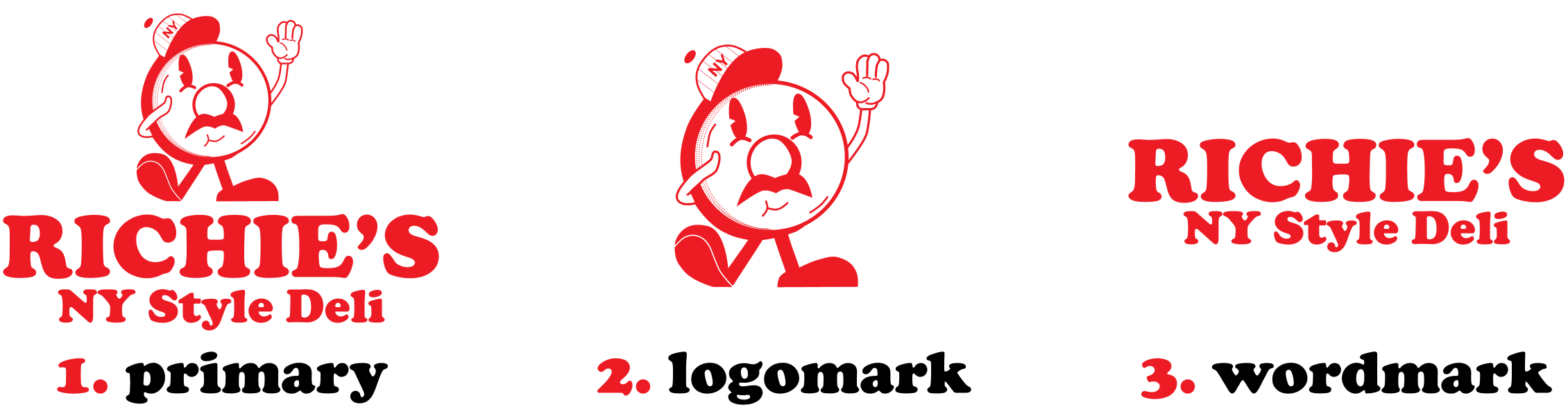
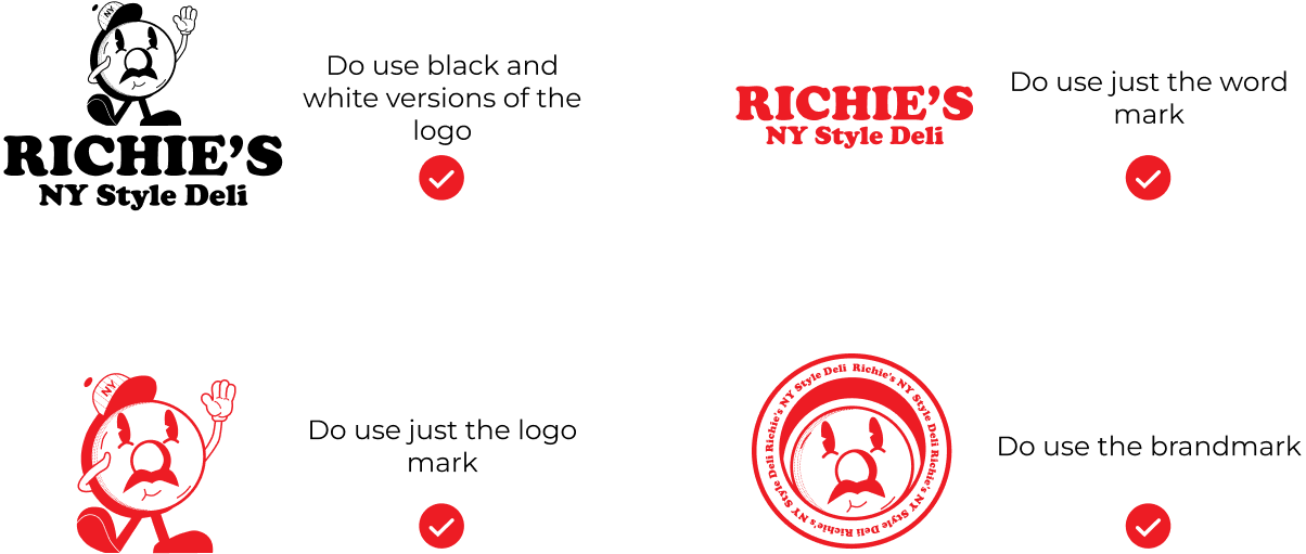
our brand
imagery
Authentic
Convenient
Classic
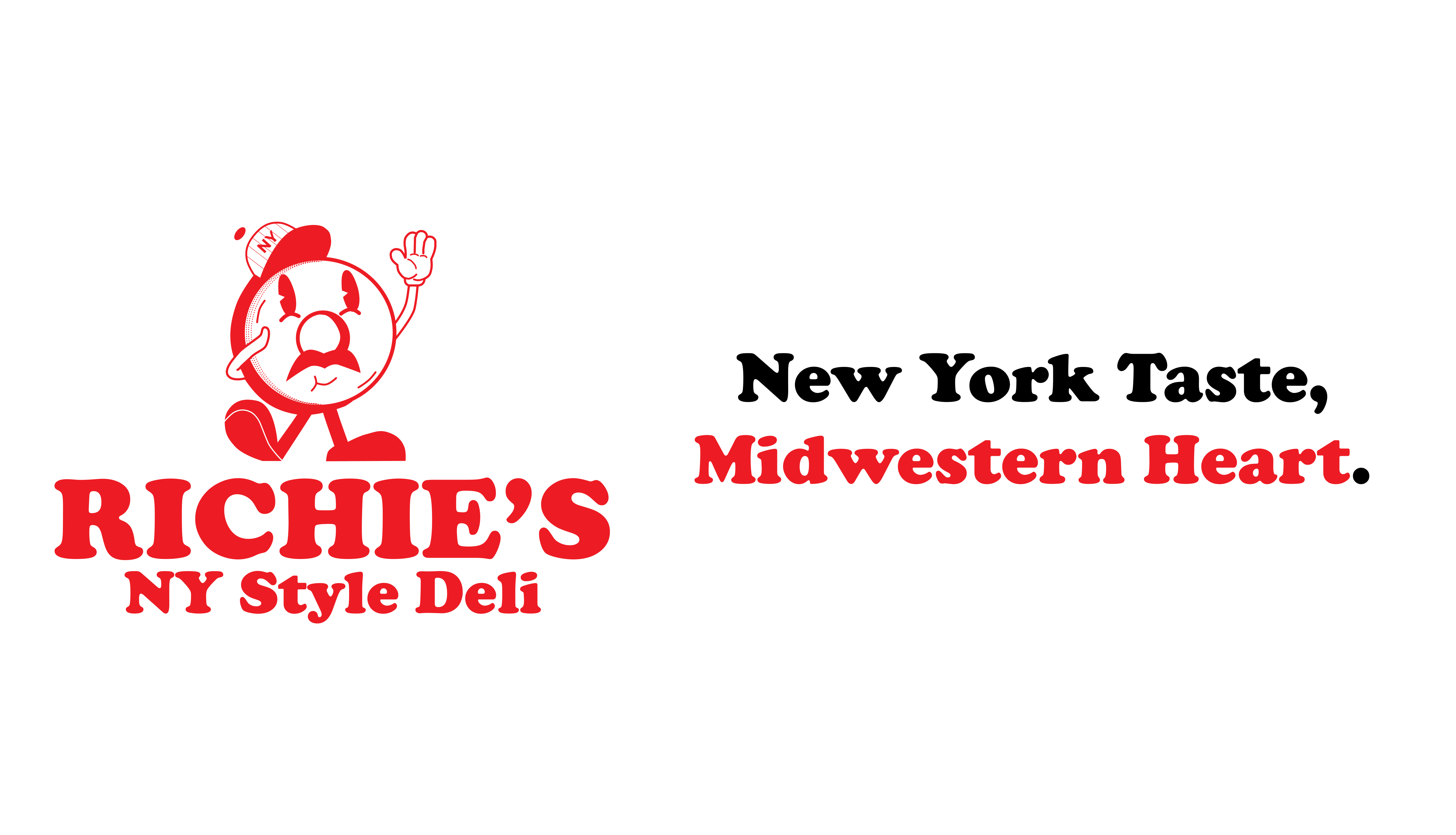
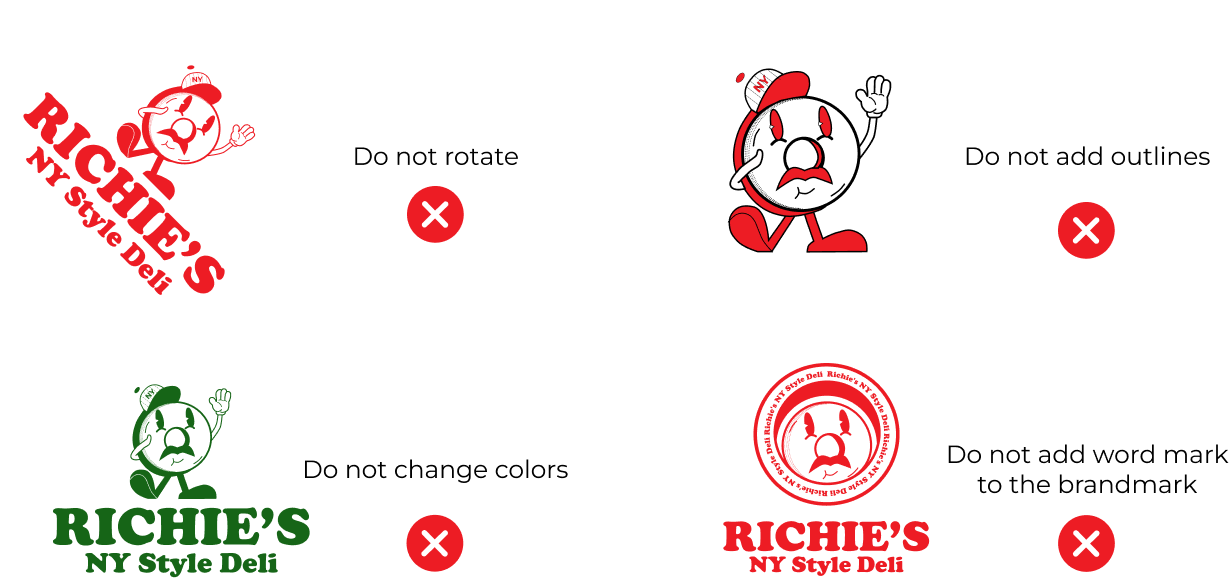
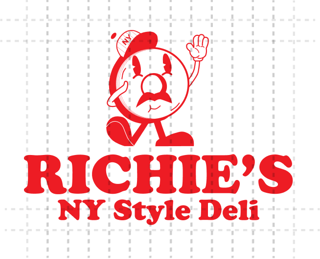
Key elements of the design reflect iconic New York and deli culture. The mustache symbolizes the archetype of an Italian worker or a classic New York deli worker, adding a touch of character and authenticity. The raised hand mimics the wave New Yorkers famously use to hail taxis, encapsulating the city’s vibrant energy. The NY-style hat, reminiscent of the iconic Yankees cap, further grounds the design in the spirit of New York City.
The wordmark, set in Cooper Black, evokes the vintage typography often seen in New York-style advertising, tying the branding to the city’s bold and energetic aesthetic. Finally, the red color bridges the New York-inspired design with UW-Madison, representing the university’s primary color and connecting the brand to the local Madison community. Together, these elements form a cohesive visual identity that celebrates the intersections of place, tradition, and flavor.
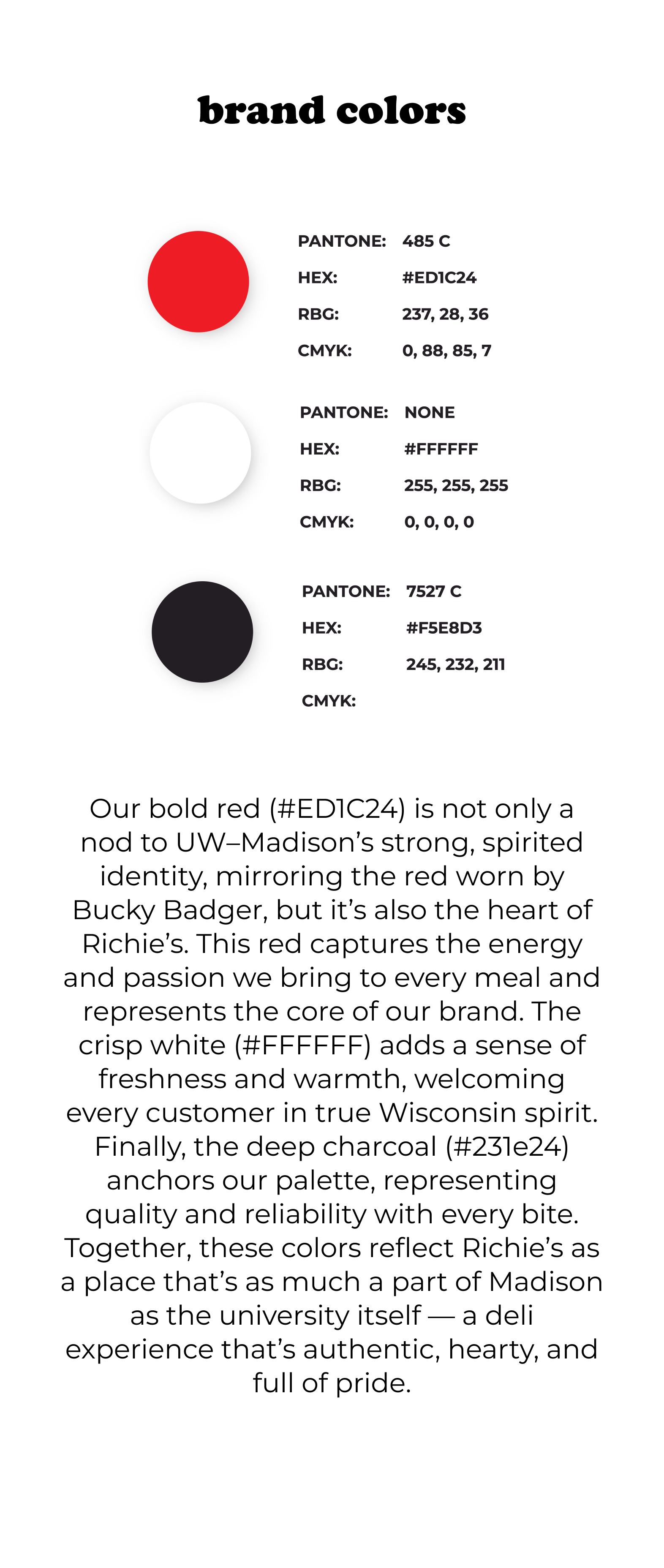
brand colors
Our bold red (#ED1C24) is not only a nod to UW–Madison’s strong, spirited identity, mirroring the red worn by Bucky Badger, but it’s also the heart of Richie’s. This red captures the energy and passion we bring to every meal and represents the core of our brand. The crisp white (#FFFFFF) adds a sense of freshness and warmth, welcoming every customer in true Wisconsin spirit. Finally, the deep charcoal (#231e24) anchors our palette, representing quality and reliability with every bite. Together, these colors reflect Richie’s as a place that’s as much a part of Madison as the university itself — a deli experience that’s authentic, hearty, and full of pride.
font design
Primary font:
Cooper Black
jumbo font
Heading
Heading
Heading
Heading
Heading
Secondary font:
Montserrat
Fluffy scrambled eggs, crispy bacon, and melted cheddar on a warm roll - $8.50
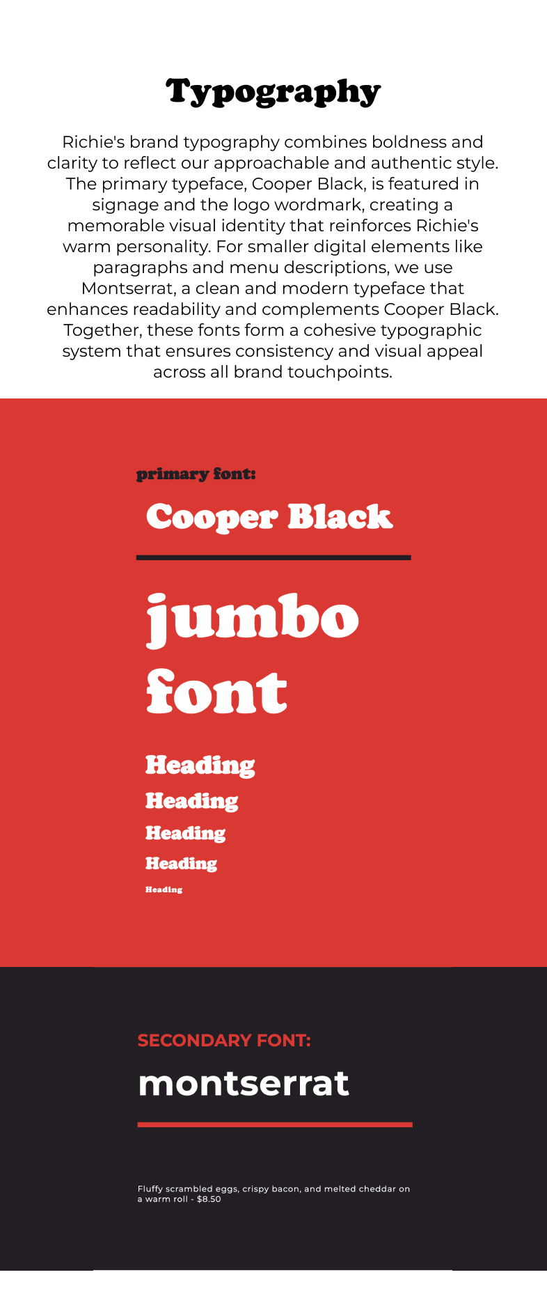
Typography
Richie's brand typography combines boldness and clarity to reflect our approachable and authentic style. The primary typeface, Cooper Black, is featured in signage and the logo wordmark, creating a memorable visual identity that reinforces Richie's warm personality. For smaller digital elements like paragraphs and menu descriptions, we use Montserrat, a clean and modern typeface that enhances readability and complements Cooper Black. Together, these fonts form a cohesive typographic system that ensures consistency and visual appeal across all brand touchpoints.
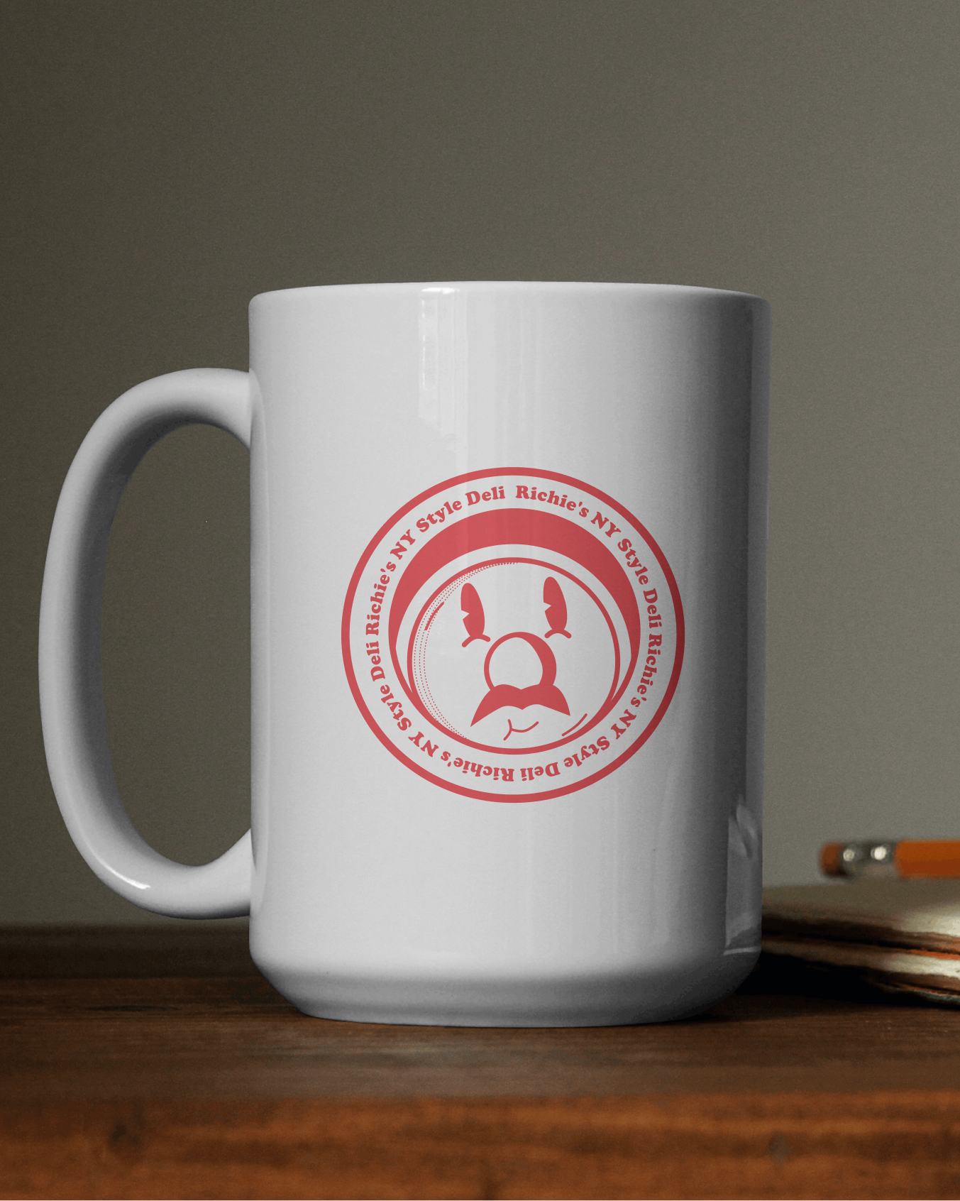
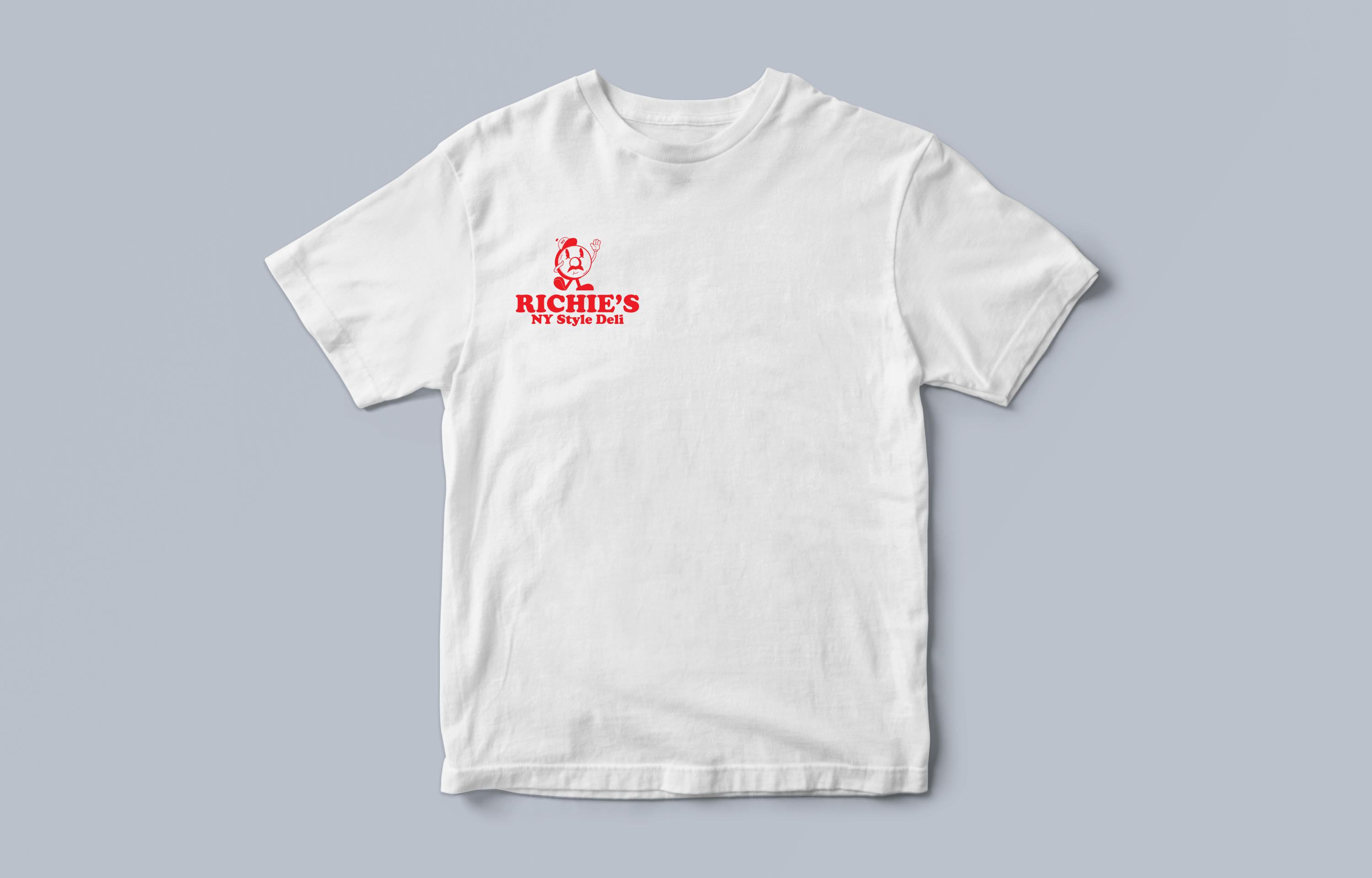
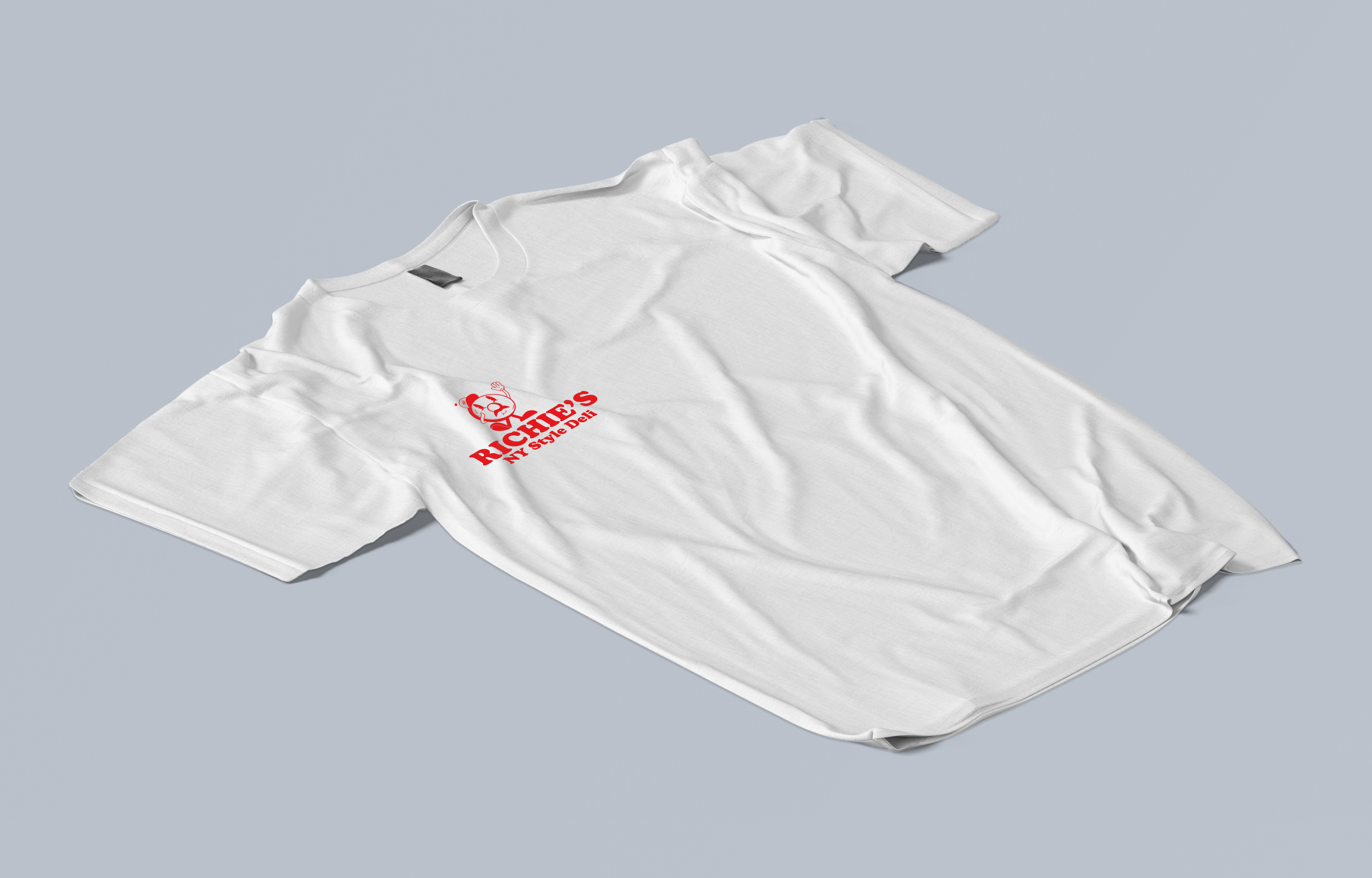
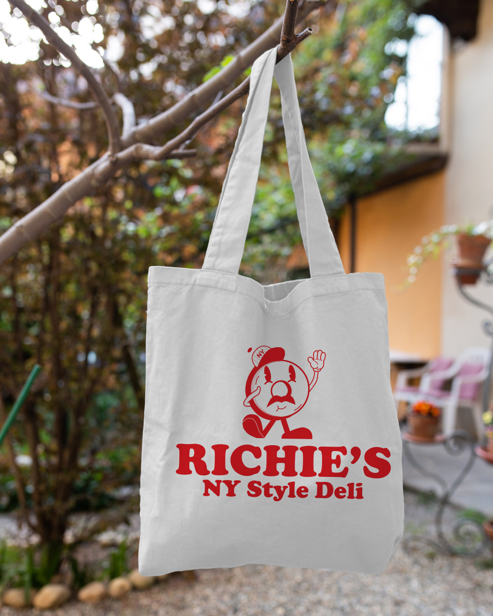
Mockups
branding
This section visualizes how the Richie's brand elements come to life on merchandise, emphasizing consistency and brand identity across various items. Each piece integrates Richie's bold colors, signature fonts, and logo for a cohesive look that reinforces the brand's authenticity and warmth, whether customers are on the go with a tote, enjoying a coffee, or sporting our classic T-shirt.
t-shirt
tote bag
mug